Gcash is the mover towards serving the underserved market in mobile payments. So, in relation to the brand upgrade from a simple technology company to a lifestyle product, a logo update was underway.
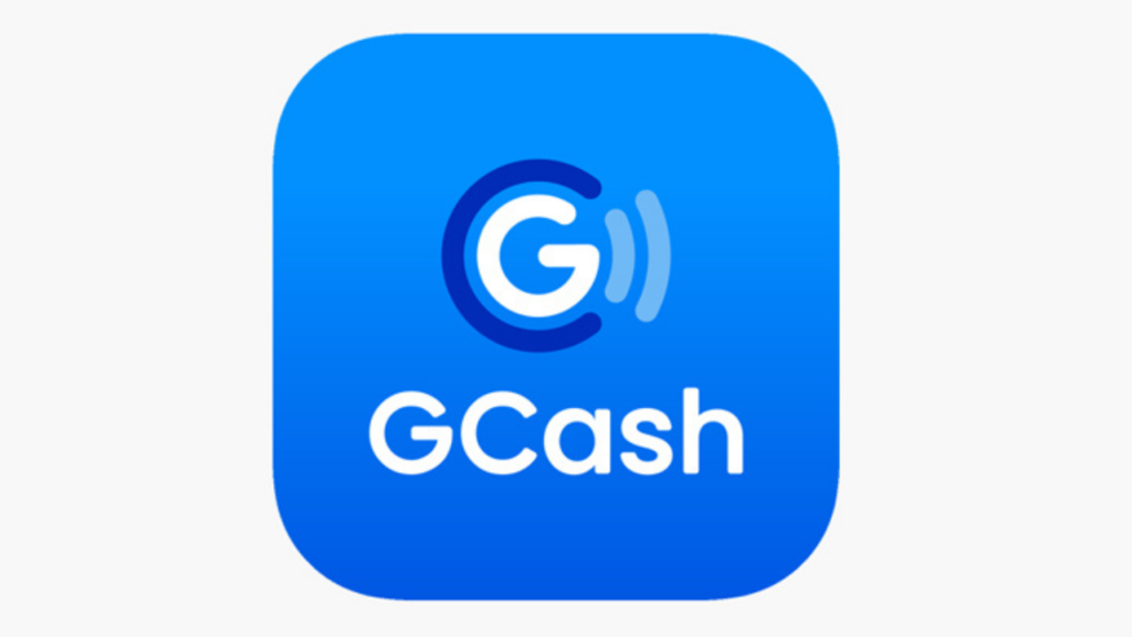
The new Gcash Logo reflects a reliable and professional image while keeping the element of life and play. The Gcash logo, according to its design team, had 3 elements:
- The clear, central letter G
- Round integrated C which symbolizes money and coins.
- The pay waves exemplifying the mobile nature of the brand.
All three combined show the versatility and everything the Gcash can do for its market. The shift from the original deep blue hue to light blue showcases a vibrant approach to the novel way of handling your finances that’s fresh and dynamic.
Gcash Logo PNG
Gcash Logo Transparent
Overall, it provides a balance of security and credibility. And, gives a warm and approachable feel that breeds familiarity with its intended audience. The simplicity of the logo aims to make the customer feel that they are in excellent hands with Gcash and they can focus on what matters the most. Read also: Create your Gcash account for Free.
Last modified: February 23, 2023
please verify to gcash soon as possible